Monday, July 29, 2013

LG Optimus G Revisited

 By Khaled Akbik

LG Optimus G was released last year in September, 2012. It has since won a number of awards, including an award at CES 2013, and acted as the primary inspiration for Google's Nexus 4 design.


LG's second iteration of this wonderful device, dubbed G2, will be launched in August (next month). In light of this imminent release, we decided to take a look at the Optimus G and revisit what made this device the awesome smartphone it is.


The phone is beautiful to hold and look it, weighing a mere 145 g. Sporting a 2 GB of RAM and a 1.5 GHz quad-core Qualcomm Snapdragon processor, LG was one of the first in the market to entertain such powerful and industry leading specs.

The display is an absolutely stunning 4.7" True HD LCD touchscreen with 768x1280 pixels (318 ppi pixel density), compare this to iPhone 5's 4" Retina display with 640x1136 pixels, 326 ppi pixel density and you'll get a feel of how ahead of its time the LG was.


The Optimus G has a 13MP/8MP (depending on market) shooter with a 1.3MP front camera. Records full HD videos at 1080p (30 fps). Check some sample pics at the end of this post.


The device is beautiful to hold and use. The back is made of glass with a shimmering pattern that is visible when moving the device across the light. The front is protected with Gorilla Glass 2 with capacitive (no physical) buttons at the bottom.

The moment you turn the device on, you'll be pleasantly shocked at how pretty the screen is. The full HD is clearly evident and the colors are true and vibrant. The Optimus G was a delight to use.

Fast and beautiful, full of top notch specs and with a performance that matches them. This phone has clearly been underestimated, and drowned out by the noise other vendors like Apple and Samsung make when launching their products.

We can't wait to see how LG will top this wonderful device up with the G2 next month. We're very excited about the launch and will work on getting a unit early on to review.

So, if you're in the market for a new smartphone and you're unsure which one to get, hold off your purchase for a month or so and stay tuned with us here at Gadget Camel to see what the G2 will hold on store.


Saturday, July 13, 2013

Mobile Summer Safety Alert


As the first day of summer is upon us, Qualcomm, mobile and wireless technology leader, has issued a mobile summer safety alert to keep our best-technology-friend safe all summer long – from the sandy beaches to the refreshing pool:

Qualcomm’s Mobile Summer Safety Alert
·         Tip 1: How To Avoid An Overheated Phone
o   Turning up the summer heat is good for your soul, but not for your devices. Thermal efficiency is a major concern with modern smartphones and tablets (remember when we melted butter on an array of devices?). As you’ll see from the video, Qualcomm’s engineers put a lot of work into ensuring that devices running on Snapdragon processors stay cool while delivering all the performance and features you expect from a smartphone. Mobile cool-down tip: throw your phone in the freezer for a quick cool-down or be proactive and keep it out of direct sunlight by always keeping it tucked under your beach towel or cover-up.  
·         Tip 2: How To Save A Water-Submerged Phone
o   Water and technology are a lethal combination. If you happen to drop your phone into the pool or lake this summer, a quick save it to put your phone in a bowl of uncooked oatmeal or rice!
·         Tip 3: How To Do More and Recharge Less
o   When it’s summertime, you are always out and about. Your days start at the beach and end at an outdoor concert, with no time to stop at home and recharge. Your whole day can be sidetracked if your battery dies. Qualcomm has created Snapdragon™ BatteryGuru, a free Android app for Snapdragon-powered devices that uses both software and hardware to improve battery life. The app works by learning users’ behavior and intelligently adjusting smartphone settings to minimize background activities without disabling smartphone features.
·         Tip 4: How to Find a Kidnapped Phone
o   Losing a smartphone is the pits.  Luckily most smartphone OS’ offer free built-in services to help track a missing phone.  The only catch is you have to not be lazy—take a few minutes to make sure your phone is all set up to be found in an emergency! Click the links below for more info: (iOSWindows PhoneBlackBerry 10, Android – no native service available.  However, try the free app from Lookout)
·         Tip 5: How to Avoid a Scratched Phone
o   Your smartphone slipping out of your hand is already a common occurrence. Add sunscreen, water and cocktails – and your smartphone is bound to slip and scratch this summer. Add “scratch protection”. There’s many simple inexpensive protectors you can slap on your display to protect it from scratches.  Screen protectors like ZAGG invisibleSHIELD and Armortech can shield your smartphone display from permanent damage caused by accidents.

Wednesday, July 10, 2013

Ramadan Apps


Source: Team Oompa Loompa's blog

Another year flies by and here we are with the holy month of Ramadan at our doorstep. Gadget Camel & Team Oompa Loompa would like to wish everyone a blessed month — and in this post we will be highlighting some apps you can download on your android phones to add to your Ramadan experience.

iQuraniQuran / iQuran Lite: originally an iOS app, developer Guided Ways has imported this beautiful Quran app into android — and it looks crisp and clean on the Galaxy S4. The app is easy to use with a clean and polished interface. Instead of present the Quran in a traditional “page” format, iQuran lists the verses in sentences, each of which is tap-responsive for bookmarking, recitation, and translation. Built in are plenty of translation options into several languages, and the Pro version has more recitation voices to choose from. The fonts are large and easy to read. If you’re fine with the presentation of the verses, this is is a must-have Quran app on your phone.


Quran Android
Quran Android: This is a “traditional” alternative to iQuran, with the verses presented as they are on a physical Quran. The pages are high resolution and appear crisp and clear on the Galaxy S4. The interface follows the holo guidelines and is simple and to the point. You have bookmarking and sharing options too. It does not have the many features of iQuran, but if you’re looking for a simple, clean, and traditional Quran app experience, then this is for you.

My Prayer Android
My Prayer: and oldie but goldie, this is one of the apps we personally love and adore. There are many prayer time apps on the android platform, but very few are as beautiful and as functional as My Prayer. Clean lines and Islamic artwork blend in yellow, black, and white, making it not only easy to read but also look great in the four different widget modes you have. There are default reading of prayer times based on your location, but you can manually change the offset for each as well add special timings for Ramadan. You can’t go wrong with this one.

Salatuk - Android
Salatuk: Similar to My Prayer app, Salatuk keeps tabs on your prayer timings. It sports a different interface with blue, white, and grey, and works just as well as My Prayer. It also has an added compass for Qibla. There is only one widget option, though, as of this writing.


Daily Hadith - AndroidDaily Hadith: an simple, elegant app that fetches for you a new hadith daily. You can browse back to see previous hadiths that have been pushed out on to the app. Our only gripe is that the ads are a bit distracting — particularly if it is a car loan — but they aren’t invasive or have funny colours.

Ramadan Achievements - Android
Ramadan Achievements: an interesting take on “to do lists”, Ramadan Achievements give you a list of things that we often forget to do — like calling friends, family, giving charity, etc — and you need to do each of the tasks three times to mark it as fully complete. We hope you won’t be cheating in on this one, especially if you’re dreading that phone call to the aunt you’d rather never see again! The app is ad-supported.
Team Oompa Loompa is certain that you’ve found this list useful — and you can always add your suggestions to the comments!

Saturday, July 6, 2013

Lenovo K900 Smartphone Review


By Kinan Jarjous

Lenovo is probably not what comes to mind when you're shopping for a new android phone. In a market that is almost synonymous with Samsung, there is little room left for what defines a good android phone. Lenovo smartphones have had presence in the Chinese market and are now making their way into this region.

Lenovo is out with six different models (all android), and I was handed their flagship phone – the K900 – for review.

Build Quality

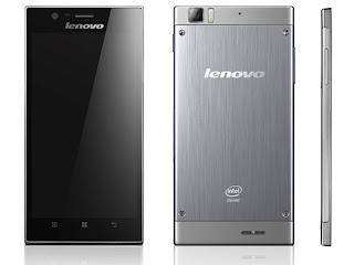
When you buy the K900, you'll get a big, black box with "K900" cut out. With a 5.5" screen, the K900 goes with the phablet category along with the Samsung Galaxy Note II. From the size alone, this isn't a phone for everyone. That's just the screen though; the actual phone size is roughly 6"x3". To put it in perspective, it can cover three rows of icons on the iPad 3 and stretch the width of the visible iPad screen. It's a big phone.

That said, it is a light phone. Very light for its size, in fact. And ridiculously slim too: at 6.9mm it is even thinner than the iPhone 5. The phone feels posh to hold, with great finishing and metal casing industrial design. Nothing about this phone feels cheap. 

Screen

As mentioned, the screen is 5.5" making this a phablet and not a phone. The screen is just gorgeous to look at, with 1080 x 1920 pixels, at around 400ppi. The colours are natural, with nice deep blacks and natural-looking whites. The text is crisp, and photos are rendered faithfully.

The UI

Like many other manufacturers, Lenovo implemented its own UI on top of android. When many manufacturers are opting for a simpler design, Lenovo went the opposite direction with an industrial look. The interface has cues from a manufacturing plant, with plenty of grey, steel gradients, and even bolts. It looks nice in some places but in others it is distracting and difficult to adjust to. SMS in particular is a miss, with small fonts and clumsy looking UI. The phonebook and dialler are better looking, though the contact-adding screen leaves a lot to be desired for.


The home screen itself eventually stutters in typical android fashion and moving icons around and into folders is rather cumbersome. Thankfully all of those can be easily remedied with different launchers or replacement apps.

What I really liked though is the photo album. It displayed the images in a beautiful mosaic sorted by day. You can switch on different modes to view the albums, like the default folder view for example. The UI is slick and modern – different than the industrial look of the rest of the phone.


What is neat though is that the calendar and keyboard are from stock android, which is great but also adds inconsistency in the design, with some default apps having a Lenovo UI and others defaulting to stock android. Other aspects of the launcher show some inconsistency in fonts. Again, as with android, this is all customisable and most users will be installing all sorts of different configurations, but out of the box there is inconsistency.


Performance

Intel is powering the K900, making it more of a PC-phablet than any other phablet. AnTuTu results below show how it ranks against the Galaxy S4 and the HTC One, and it fares better in some aspects. In real usage, though, there is little difference. I had to do away with the default launcher in order to properly use the phone. Launcher aside, everything was blazing fast. I could switch between applications quickly and all apps performed rather well, with only little stuttering here and there which is endemic to android.


Gaming performance leaves a lot to be desired for. While the benchmarks were great, in reality some games show lag. Comparing a couple of games running on the K900 and the Galaxy S4 you’ll also notice some effects, lighting, or reflections not being rendered.

Battery performance is very good. During the first couple of days it lasted 8 hours – but that is normal when a lot of time is spent in installing and configuring the phone to one’s liking. The rest of the week with my normal usage it took 12-16 hours for the juice to run low. Quite a far cry from the Lumia 920 I was carrying before. There is some battery tech wizardry that allows for a fast charge to 80% then slowing down until it trickles its way to 100%. Some customisable presets to instruct the phone on what to do when the battery becomes low are also available. While there are many power-saving apps on the Play Store, Lenovo decided to create their own embedded power management system and it works very well.


Camera

There are 13MP in this camera, and they're good megapixels, but not the best. You'll get plenty of detail depending on the situation, with some odd lights and low light taking a hit on the camera. The night shots are decent but it's not a Lumia. HDR looks ok but also introduces noise into the image.

There are plenty of bells and whistles packed into the camera. Aside from your usual settings (night mode, HDR, panorama, macro, etc) and white balance and ISO, you get some nifty filters. Lots of them. You have your usual instagram-like filters and you can also add some special effects like fisheye and a quite powerful tilt-shift effect.


The front camera has a nice wide-angle lens which reminded me of the HTC 8X. I still fail to see why this isn't a default for all phones; it does make a huge difference when you want to send a pic to your friends or family living abroad of where you are at the moment. Macro shots are fine, and the autofocus is usually very good as long as you’re within the camera’s focus limits. 


Conclusion

The K900 is Lenovo’s flagship phone in their endeavour to enter some ME markets. The phone has a beautiful and industrial look and feel to it, making it stand above the rest of the crowd in its category. The UI needs more refinement in some areas out of the box, but are easily remedied with replacement apps. Packing in a better, higher resolution screen and a better camera than the Galaxy Note II, and if plastic isn’t for you and you’re in no need of plenty of bloatware or other tech features that the Note offers, then the Lenovo K900 is a great phablet..